Learn CSS Grid
Page Contents
Grid Terminology
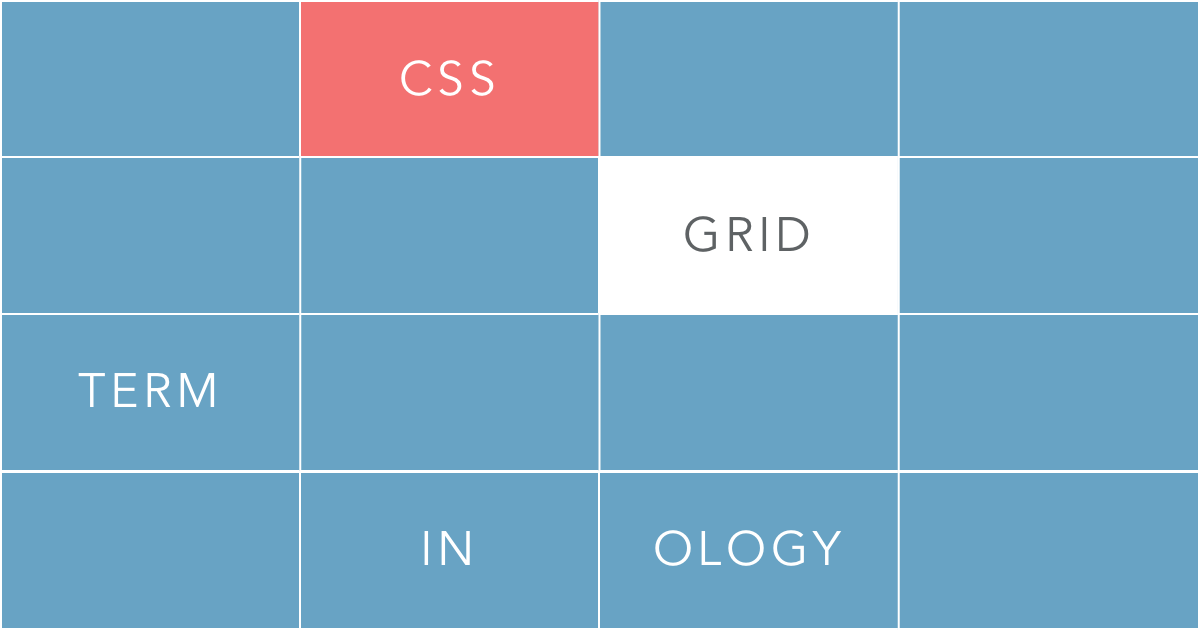
- Grid Area
- - A grid cell or group of cells that the developer names within the grid.
- Grid Track
- - Grid tracks are each of the columns and rows.
- Grid Cell
- - An individual cell within the grid.
Defining a Grid
First we add our grid container and its contents.
<div id="grid1">We add our "Grid Container" (Parent)
                        element and "Grid Items" (Children) Elements

                            <div class="cell">1</div>

                            <div class="cell">2</div>

                            <div class="cell">3</div>

                            <div class="cell">4</div>

                            <div class="cell">5</div>

                        </div>
Next we add our CSS.
.cell {We add background colors and align the numbers to the center of the
                        divs

                            background: lightgrey;

                            text-align: center;

                        }


                        .cell:nth-of-type(even) { background: darkgrey; } Zebra Striping for Grid
                            Items


                        #grid1 {

                            display: grid;


                    }
The display: property is applied to the Parent element. Once display grid has been initiated, the children elements will line up in a single column on the page.
Back to top
Defining Grid Columns
First we add our grid container and its contents.
<div id="grid1">We add our "Grid Container" (Parent) element
                        and "Grid Items" (Children) Elements

                            <div class="cell">1</div>

                            <div class="cell">2</div>

                            <div class="cell">3</div>

                            <div class="cell">4</div>

                            <div class="cell">5</div>

                        </div>
Next we add our CSS.
                        #grid1 {

                            display: grid;

                            grid-template-columns: 1fr 1fr 1fr;

                            background: #5c7fa3;

                    }
To specify columns, we use the grid-template-columns: property.
Available Units of Measurements
Within the grid-template-columns: property we can define column widths with the following properties.
- Fraction Units (fr)
- Pixels (px)
- Em Units (em)
- Rem Units (rem)
- Percentages (%)
We end up with a grid that has 3 columns each 1fr (1 Fraction) of the available space.
Back to top
Defining Grid Rows
First we add our grid container and its contents.
<div id="grid1">We add our "Grid Container" (Parent) element
                        and "Grid Items" (Children) Elements

                            <div class="cell">1</div>

                            <div class="cell">2</div>

                            <div class="cell">3</div>

                            <div class="cell">4</div>

                            <div class="cell">5</div>

                        </div>
To specify rows, we use the grid-template-columns: property.
Quick Tip: Rows generate automatically but with grid-template-rows: you can specify the height of each row.Now we just add the CSS.
                        #grid1 {

                            display: grid;

                            grid-template-columns: repeat(2, 1fr);

                            grid-template-rows: 50px 75px 100px;

                            background: #5c7fa3;

                    }
Back to top
Defining Grid "Padding"
First we add our grid container and its contents.
<div id="grid1">We add our "Grid Container" (Parent) element
                        and "Grid Items" (Children) Elements

                            <div class="cell">1</div>

                            <div class="cell">2</div>

                            <div class="cell">3</div>

                            <div class="cell">4</div>

                            <div class="cell">5</div>

                        </div>
We can add "padding" or Cell Spacing to our grid by using the grid-row-gap: and grid-column-gap: properties;
Next we add our CSS.
                        #grid1 {

                            display: grid;

                            grid-template-columns: repeat(3, 1fr);

                        grid-row-gap: 50px;

                        grid-column-gap: 50px;

                            background: #5c7fa3;

                    }
Positioning Items With Grid Areas
We can position items within a grid in two different ways. The first being with grid areas.
First we add our grid container and its contents.
<div id="grid1">We add our "Grid Container" (Parent) element
                        and "Grid Items" (Children) Elements

                            <div class="cell header">header</div>

                            <div class="cell nav">nav</div>

                            <div class="cell sidebar">sidebar</div>

                            <div class="cell main">main</div>

                            <div class="cell footer">footer</div>

                        </div>
Next we define the grid areas within the grid container selector by using the grid-template-areas: property.
                        #grid1 {

                            background: #5c7fa3;

                            display: grid;

                            grid-template-columns: repeat(3, 1fr);

                            grid-template-rows: 25px 25px 100px 25px;

                            grid-row-gap: 50px;

                            grid-column-gap: 50px;

                            grid-areas: Here we define each cell within the grid
                        with a name.

                            "header header header"

                            "nav nav nav"

                            "sidebar main main"

                            "footer footer footer";

                        }
Finally we use the grid-areas: to assign each child element to an area within the grid.
                        div.header { grid-area: header; }

                        div.nav { grid-area: nav; }

                        div.sidebar { grid-area: sidebar; }

                        div.main { grid-area: main; }

                        div.footer { grid-area: footer;}
Back to top
=Positioning Items by Columns and Rows
We can also define the position of child elements with a grid using the grid-column: & grid-row: properties respectively.
First we add our grid container and its contents.
<div id="grid1">We add our "Grid Container" (Parent) element
                        and "Grid Items" (Children) Elements

                            <div class="cell header1">header</div>

                            <div class="cell nav1">nav</div>

                            <div class="cell sidebar1">sidebar</div>

                            <div class="cell main1">main</div>

                            <div class="cell footer1">footer</div>

                        </div>
Next we define the grid areas within the grid container selector by using the grid-template-areas: property.
                        #grid1 {

                            background: #5c7fa3;

                            display: grid;

                            grid-template-columns: repeat(3, 1fr);

                            grid-template-rows: 25px 25px 100px 25px;

                            grid-row-gap: 50px;

                            grid-column-gap: 50px;

                        }
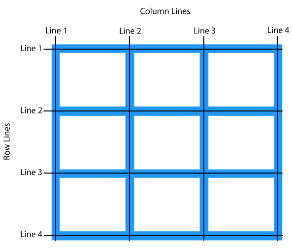
This picture shows how the grid column and row lines are defined. Notice that the left and top lines start at number "1", this is important to remember when laying out a grid using the grid-row: & grid-column: properties.
Quick Tip: Grid Rows and Columns Start at "1". The first number of grid-row: & grid-column: defines the track to start the child element, and the second number defines where that child element ends.Finally we use the grid-row: grid-column: to define where each child element starts and ends within the grid using the grid tracks for alignment.
                        div.header1 {

                        grid-column: 1 / -1;

                        }

                        div.nav1 {

                        grid-row: 2 / 4;

                        grid-column: 1 / 2;

                        }

                        div.main1 {

                        grid-row: 2 / 4;

                        grid-column: 2 / 3;

                        }

                        div.sidebar1 {

                        grid-row: 2 / 4;

                        grid-column: 3 / 4;

                        }

                        div.footer1 {

                        grid-row: 4;

                        grid-column: 1 /-1;

                        }
Back to top
Grid Cheat Sheet
| Property | Description | |||||||||
|---|---|---|---|---|---|---|---|---|---|---|
| grid-template-columns | Specifies the size of the columns, and how many columns in a grid layout |
|
||||||||
| grid-template-rows | Specifies the size of the rows, and how many rows in a grid layout |
|
||||||||
| grid-gap | A shorthand property for the grid-row-start and the grid-row-end properties |
|
||||||||
| grid-template-areas | Specifies how to display columns and rows, using named grid items |
|
To check out this cheat-sheet, please use landscape view, or check it out on a tablet or computer!