What is CSS Grid?
CSS Grid is a layout system based on a grid that allows developers to have a more options for layout as well as making web-page design easier and reducing the amount of markup that it takes to make a web-page.
Layouts with CSS Grid
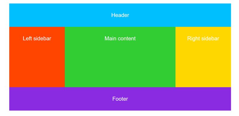
Grid allows your page to have multiple columns without the need for floats.
How can CSS Grid Reduce my Markup?
One of the great things about css is it reduces markup needed in both HTML and CSS.
With grid, you define a single column grid for mobile phones, a 3 column grid for tablets, and finally a 4 column grid for wider screens.
Grid reduces the amount of unnecessary div's needed to describe rows and columns like bootstrap uses.
Does CSS Grid Replace Flex-Box?
One might think that now that we have the grid we can use it exclusively instead of previous layout techniques, however the inverse is true.
CSS Grid is actually meant to compliment grid, meaning you can use them both together to achieve the layout you're shooting for.
Within a CSS Grid, you can place another grid container, or flex-box container.